Solo
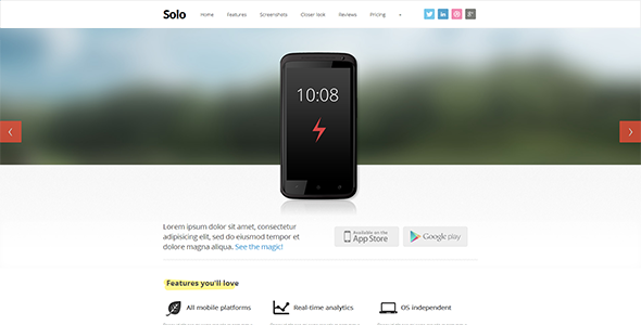

Solo – responsive single-page template
“Solo” is a single-page responsive HTML template with 12-column grid based on Twitter Bootstrap – popular and powerful front-end framework. This clean and easily maintainable template will perfectly suit for any single-page site to promote your work, whether is it a site for web application, mobile app or even a desktop software. It is based on latest HTML5 & CSS3, comes optimized for mobile devices and includes a LESS stylesheet for easy customization.
Features
- Responsive HTML5 and CSS3 design
- Based on latest Twitter bootstrap (2.1.1)
- less.css stylesheet with variables and useful mixins
- jQuery 1.8.2
- Sticky Navigation
- Photoshop source (layered PSD) included
- Support for touch gestures on mobile devices
- Google Web Fonts
- Cross-browser compatible
- Clean design and well structured code
- Carousel with different placeholder images
- Pricing tables
- Customizable keyboard shortcuts
- Documentation
- Extra icons of all popular social networks (over 30 icons)
- Easy to work with and extend
- & more
Layout is divided into following sections
- Carousel with touch gestures
- Download
- Features
- Screenshots
- Closer look
- Reviews
- Plans and pricing
PSDs
Layered PSD of layout designFonts
Google Web Fonts – Open SansImage attribution
Following images were used in preview. These images are not included in template souce files.- Pure Toutch iPhone User Interface by mesbahismail
- Anchor Calendar App by Alex tapein
- Tringa – Mobile Template by Arianeet
- Sventh Sin by creattica
- Tablet/Phone User Interface Professional Set V. 5 Mobile DJ by diegomonzon
- Pro UI Set by Rafael Oliveira
- Android Theme: Pandora by App Juice
- Bzzy App by AG Fabrega
- BP Oil Spill on visual.ly
- Rechner by Berger & Föhr on vimeo.com
Changelog
v1.0 – Oct 6th 2012- Initial version
$17 |
Download |
4.4 average based on 28 ratings.

| Last Update | 2012-10-08 |
| Created | 2012-10-08 |
| Sales | 255 |
| Discussion | Comments |
| Columns | |
| Compatible Browsers | IE7 IE8 IE9 Firefox Safari Opera Chrome |
| Compatible With | Bootstrap 2.1.0 Bootstrap 2.0.4 |
| Documentation | Well Documented |
| High Resolution | |
| Layout | Responsive |
| ThemeForest Files Included | Layered PSD HTML Files CSS Files JS Files |
Search themes
Browse Categories


