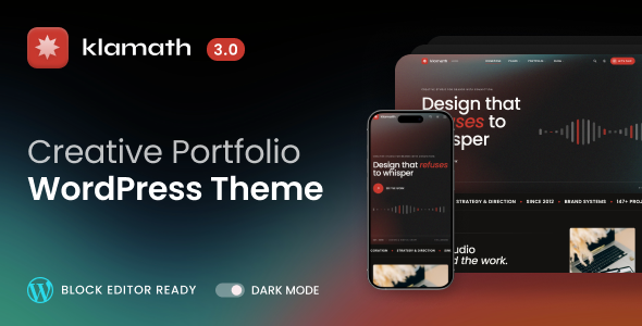
Klamath - Creative Portfolio WordPress Theme

 |  |
 |  |

Licensing
All demo assets are properly licensed and usable after import. No restricted media, no attribution walls.
- Images: Unsplash
- Videos: Pexels
- Fonts: Google Fonts (Source Serif 4, Poppins)
- Icons: Tabler Icons (MIT)
- Animations: GSAP (free)
No API keys or paid subscriptions required. Fully functional out of the box.
Klamath – Creative Portfolio WordPress Theme
The gap between a portfolio that looks impressive and one that actually performs as designed is wider than most themes acknowledge. Pages flicker on load. Animations feel bolted on. The mobile version is an afterthought. Klamath was built around the assumption that every part of the experience matters – not just the hero section, not just desktop. Navigation transitions without interruption. Motion follows a coherent system. The result is a site that holds together the way considered design should.
Klamath fits the full range of creative work: independent designers and developers who want their site to match the quality of their output, small agencies that need room to grow into, studios presenting a team and a body of work, photographers and architects who lead with image, and anyone who has outgrown a theme that looked great in the preview but felt hollow in use.
There is no page builder involved. Content is built using 37 purpose-built blocks inside the native WordPress editor, styled through a deep settings panel, and ready to use the moment the demo is imported.
Navigation Without the Interruption
Every internal link loads the next page without a full browser reload. The transition is immediate – a smooth swap rather than a flash and a jump. The header stays anchored throughout. Links begin loading the destination page the moment you hover over them, so by the time a visitor clicks, the content is already there. The experience reads as a single, continuous surface rather than a sequence of separate page loads.
37 Blocks, Zero Page Builder Dependency
Every section type you need – hero variants, feature grids, service listings, team showcases, stat counters, testimonial carousels, FAQ accordions, pricing tables, process timelines, portfolio grids, and more – ships as a native block you drop into the WordPress editor. What you see in the editor is exactly what appears on the live site. No shortcodes, no proprietary builder panel, no abstraction layer between your content and the output.
Motion With a Logic Behind It
Klamath uses GSAP throughout. Text reveals line by line as sections enter the viewport. Elements stagger into place with consistent timing. Background layers shift at different rates as you scroll. The approach block cycles through principle images with smooth crossfade transitions tied to your click. The system is deliberate: a shared timing and easing curve runs through every animated element, so the page reads as a designed sequence rather than a collection of independent effects.
Portfolio That Documents the Work, Not Just Shows It
Each project entry supports images, video, and structured case study data – client, timeline, deliverables, role – displayed as a clean stat strip automatically. Attach relevant tool and software icons from a library of 80+ brand marks. The built-in comparison slider lets you show before-and-after states on a single project page. Related work surfaces by category without manual configuration. The portfolio archive supports multiple layout modes – grid, list, masonry, carousel, and fullscreen – switchable from the settings panel.
From Install to Live in Minutes
Install the theme, activate the companion plugin, and run the one-click demo import. Pages, menus, content blocks, and settings configure themselves without any manual steps. The site is functional and complete immediately. From that point, it is a matter of replacing demo content with your own – nothing needs to be rebuilt from scratch.
Multiple Layout Modes for Portfolio and Blog
Switch the portfolio archive between grid, list, masonry, carousel, featured, and fullscreen from the settings panel and the entire layout restructures – different proportions, different spacing, a different visual character. The same applies to the blog: grid, list, classic, featured hero, magazine, and more. These are genuinely distinct layouts, not the same card redrawn in a different column count.
Dark Mode Done Properly
The dark variant is not an inverted color scheme – it is a separately considered palette with its own background depths, shadow weights, and contrast calibrations. On first visit the theme reads the system preference and matches it automatically. After that, it respects whatever the visitor chose and remembers that choice across sessions. The toggle is available on every page. Page transitions, animations, and all interactive elements function identically in both modes.
Every Screen Treated as a Real Target
The layout was built mobile-first. Spacing, type sizes, and interaction targets are defined for small screens first and scaled up. Scroll-based effects reduce automatically on touch devices to avoid interference with native scrolling behavior. The mobile menu opens as a full-screen overlay with its own entrance animation. Every interactive element meets minimum tap size requirements. None of this was patched in at the end.
Performance That Doesn’t Require a Plugin Stack
Images load with progressive blurred placeholders that resolve to full detail as the image arrives. Scripts initialize after the page is ready. GSAP animations target only GPU-composited properties, keeping layout reflow out of the animation loop entirely. The result is consistently strong performance scores across every page template – without a caching plugin, an optimizer, or anything else layered on top.
One Design System, Applied Everywhere
Set your accent color, typefaces, and global style once. Every block, every section, every editor preview reflects those choices without you touching individual components. Block styles (dark sections, muted sections, card variants, ghost buttons, icon lists) and ready-made page patterns keep the entire site in system without requiring anyone to remember what the correct values are.
Code That Holds Up Under Inspection
No jQuery. No heavy frameworks. The front end is written in modular, modern JavaScript compiled to a single optimized bundle. CSS is generated from a structured SCSS architecture with a complete token system for color, typography, spacing, and shadow. PHP targets 8.0+. Every output is escaped, every string is translatable, every function is namespaced correctly. The code reads as intentional work – because it is.
SEO, Forms, and Third-Party Integrations
When Yoast, Rank Math, or SEOPress is active, the theme defers to the plugin entirely – no duplicate tags, no conflicts. When no SEO plugin is present, the theme handles meta output, social sharing previews, and structured data on its own. Contact Form 7 is fully styled from activation. Gravity Forms and WPForms drop in without layout issues. Social sharing, newsletter modals, and email list integrations connect without modifying any theme file.
GDPR Handling That Fits the Site
CookieYes integrates cleanly and renders styled to match the rest of the interface rather than appearing as a foreign element. Page transitions, dark mode, and all interactive features remain fully intact when consent banners are active. Nothing breaks, nothing conflicts.
Updates Delivered Without the Manual Work
New versions appear directly in the WordPress updates screen and apply with a single click. No downloads, no FTP, no file replacement. Each release ships with a complete changelog so you can review exactly what changed before deciding to update.
Everything Configurable, Nothing Hardcoded
Every heading, label, image, button text, and layout choice on every page template comes from the block editor or the settings panel. The demo ships with complete, sensible defaults so the site is finished and presentable immediately. Every element can be changed independently, in any order, without opening a file.
What You Get
|
|
Documentation & Support
Full documentation covers every aspect of the theme – from initial installation and demo import to advanced customization, widget configuration, and third-party integrations. Everything is structured and searchable, so you spend less time reading and more time building.
All support is handled through a dedicated ticket system. Each request gets a direct, focused response – no community forums, no waiting for someone else’s question to get answered first.
View Documentation
Open a Support Ticket
Release Notes & Roadmap
Klamath is actively maintained and ships regular updates.
Each release includes performance refinements, new features, compatibility updates, and fixes – informed directly by real usage and buyer feedback.
Review the full version history or see what is planned and in progress:
$27 |
Download |
3.7 average based on 6 ratings.

| Last Update | 2026-04-21 |
| Created | 2019-03-27 |
| Sales | 113 |
| Discussion | Comments |
| Columns | 4+ |
| Compatible Browsers | Firefox Safari Opera Chrome Edge |
| Software Version | WordPress 6.9.x WordPress 6.8.x WordPress 6.7.x WordPress 6.6.x WordPress 6.5.x |
| Compatible With | Block Editor Contact Form 7 Elementor Elementor Pro Gravity Forms WooCommerce 8.x.x WooCommerce 7.x.x WooCommerce 6.x.x WooCommerce 5.x.x WPForms WPML |
| Documentation | Well Documented |
| Framework | |
| Gutenberg Optimized | Yes |
| High Resolution | Yes |
| Layout | Responsive |
| ThemeForest Files Included | PHP Files CSS Files JS Files |
| Widget Ready | Yes |


