CSS responsive Menupack
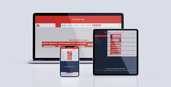

CSS Responsive Menupack is a responsive Menubars which you can use in your website by adding the CSS and JS file in your website’s folder. It’s made with HTML5, CSS3 and jQuery as per required. No Bootstrap or any other framework used. For this, it’s really easy to use. It’s totally responsive for all devices. The Tablet break point starts from 992px and mobile breakpoint starts from 767px. It’s well documented and well commented in CSS. So, the users can quickly edit the css files and you can also add your own background colors as your need and the color changing infor you will get in documentation. Here have 5 types of menubar.


Elements That used here
- HTML5
- CSS3
- jQuery
- Animated sliding indicatior on mouse slide in menubar (Own hand maded)
- Animated Hamburger
- Font awesome 5 (Some icons)
- JS Bamburger Nav icon
- Mega Menu
- Sub Menu
- Animated Sticky Nav on scroll
- No framework used like Bootstrap, UIKit and so on. So, you can use it where you want quickly.
0 average based on 1 ratings.

Search plugins
Browse Categories


