Adaptivate: Make Any Site Adaptive/Responsive
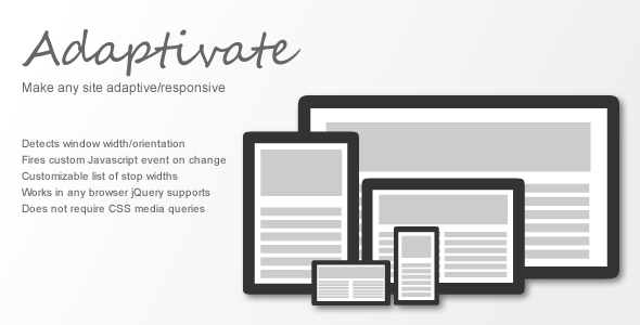

Adaptivate adds classes representing the current page width and orientation to any element you choose (e.g. the html or body tag) so that you can easily make your site adaptive/responsive without having to deal with messy CSS media queries.
Using these classes, you can create CSS rules to apply different styles based on the page width or orientation. For example, you can make the menu a fixed width on screens smaller than 768px, and fluid on larger screens. Or make list items float left on screens larger than 1024px.
Instead of using CSS media queries like “screen and (min-width: 641px) and (max-width: 1023px) and (orientation: portrait)”, you can include a rule in your css to target ”.width_gt_640.width_lt_1024.orientation_portrait”.
Adaptivate only requires jQuery, and supports any browser that jQuery does (for maximum compatibility, use version 1.9x).
3.4 average based on 5 ratings.


